
Sentris-Case Study
Sentris-Case Study
Redefining Secure Data Management for the Enterprise
Sentris is a modern SaaS platform designed to help enterprises securely manage and visualize complex internal data. Before any screen was designed, the work started with research: understanding exactly where the previous system was failing real users and why. Built with a focus on clarity, control, and compliance, Sentris is where research-driven UX meets enterprise-grade security.
Disclaimer: This case study is based on real work completed under NDA. Some details have been modified to respect confidentiality.
Service:
Client:
Year
UX Research, Strategy, UI Design, Accessibility
Sentris
2024-2025

The OBJECTIVE:
These weren't assumptions. Stakeholder discovery and direct user interviews surfaced exactly where the legacy platform was failing, before a single screen was redesigned. The legacy platform suffered from:
-
An outdated UI and fragmented user experience across internal and external portals.
-
Inefficient data access workflows, making it difficult for analysts and engineers to retrieve critical information.
-
Lack of scalability and modern accessibility standards, slowing down organizational performance.
-
With increased pressure to streamline operations and modernize its tools, the organization needed a complete redesign rooted in modern UX principles and built with a cloud-first, security-first mindset.


THE RESULT & IMPACT
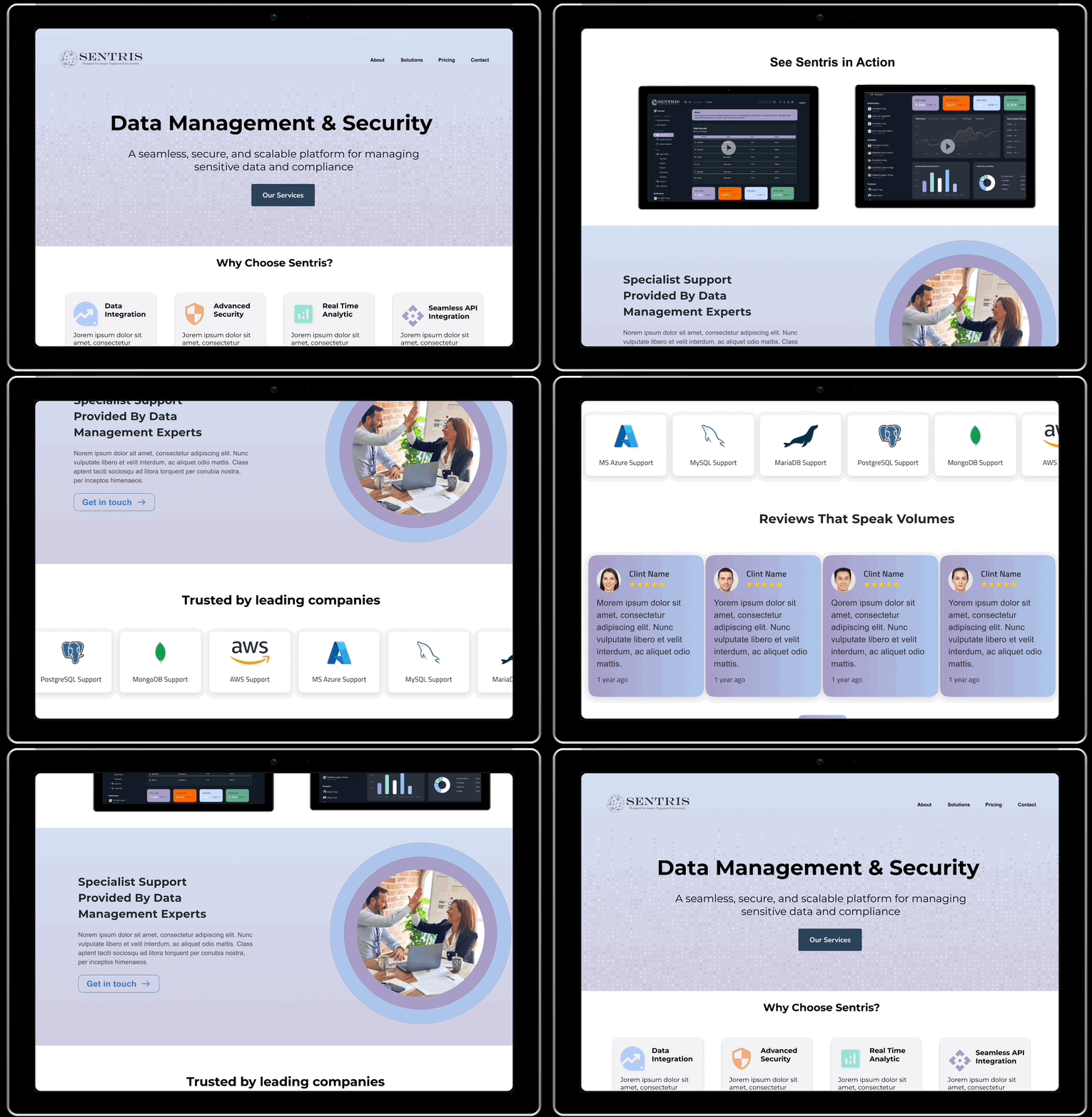
-
🚀 40% reduction in task completion time for critical workflows.
-
💡 Improved system comprehension and trust from users due to clean visual hierarchy and data visualization.
-
📊 Adoption increased across departments, especially among less tech-savvy users.
-
🔒 A scalable and compliant design system ready to support future SaaS product expansion.

The REACH & APPROACH:
Every finding above came from a repeatable process, not a hunch. Discovery conversations with stakeholders established what the business needed and where past attempts had fallen short. Direct interviews with the people actually using the platform daily surfaced pain points a stakeholder-only conversation would have missed.
A broader survey layered on top quantified which of those pain points were widespread versus isolated. From there, the findings were synthesized into personas and journey maps, which shaped three distinct design directions before a single interface was finalized. Post-launch testing continues to feed each iteration, so the platform keeps improving based on how people actually use it, not how it was assumed they would.